A signature look
The wound vine texture is unlike standard perfume caps, so the product is recognisable at a glance and the brand gains an exclusive visual mark.
Case study 01 of 07 · Fragrance
A sculpted, vine-wrapped cap made for a guitar-shaped glass bottle. It gives the brand an instantly recognisable look and fixes a common complaint: caps that slip in the hand.
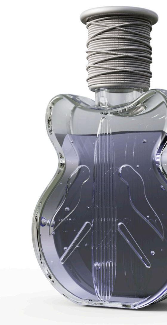
The client is a fragrance brand. Its products sat in a crowded category where bottles and caps look much alike, so the brand wanted a stronger, more recognisable product image and a better experience in the hand.
The goal was clear differentiation on the shelf and, through it, sales growth.
The bottle already had an artistic guitar shape. Instead of a standard cap, the team designed a custom cap that continues that story: a vine that winds around the neck like the strings of an instrument.
The same texture that makes the cap memorable also solves a practical problem. Smooth caps are hard to twist with dry or oily fingers; the raised and recessed vine pattern gives the fingers something to hold.
Design details
The wound vine texture is unlike standard perfume caps, so the product is recognisable at a glance and the brand gains an exclusive visual mark.
Raised and recessed lines form a non-slip surface that increases friction when twisting, so the cap no longer slips and is easier to open.
Proportions and finish were designed around the guitar-shaped glass body, so bottle and cap read as one object.
A better opening feel is a small moment the customer notices every day, which lifts how the whole product is perceived.
Gallery

Development
Each stage was reviewed before the next began. Services: appearance design, structural design, printing and finishing, injection moulding and assembly.
Concept sketches and renders of the vine form, sized and styled to suit the guitar-shaped bottle.
Thread, fit and wall thickness engineered so the cap seals properly and the textured surface can be moulded cleanly.
Surface finish and decoration chosen to keep the vine detail crisp.
Tooling, moulding and assembly of the cap for production.
The result
The cap adds two kinds of value at once: a distinctive look that builds an exclusive brand image, and a practical texture that removes a daily frustration. A packaging detail ends up raising the quality of the whole product and customers' goodwill towards it.
Developed with our design and manufacturing partner, AYWU (艾屋科技). Client names are kept confidential.
Tell us what it’s for, who it’s for and how many you need. We’ll take it from first sketch to finished product.